Cartograph
A downloadable asset pack
Buy Now$1.00 USD or more
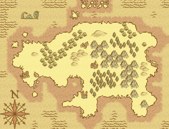
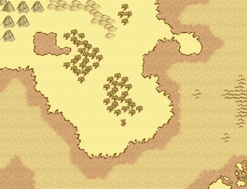
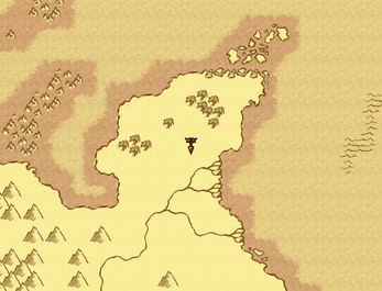
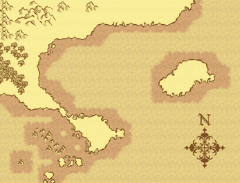
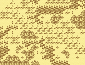
If you like to map with tilesets, this is a simple and easy option for getting the look of a hand drawn map into your game. Because of the nature of maps, it can be place in games with a variety of art styles with no style clash. There are two versions of the files, with color wash and without.
Tiles are formatted to work with RPG Maker VX Ace. It includes a full A2 sheet, a partial A5 sheet, a partial B sheet, a window skin and a character sheet of cursors.
| Status | Released |
| Category | Assets |
| Rating | Rated 5.0 out of 5 stars (5 total ratings) |
| Author | Sharm |
| Made with | RPG Maker |
| Tags | 2D, Hand-drawn, RPG Maker |
| Content | No generative AI was used |
Purchase
Buy Now$1.00 USD or more
In order to download this asset pack you must purchase it at or above the minimum price of $1 USD. You will get access to the following files:
Cartograph.zip 1.5 MB
Comments
Log in with itch.io to leave a comment.
Sorry, I don't have the capacity for a new project at this time. Good luck with your co-op.
:-O
Ah, sorry. You can tell me about requests, but I don't take commissions and I don't really have any desire to work on this anymore.
I recently purchased your map pack. Im using RMMV so I loaded the files into GIMP, scaled image to 150% and loaded it into RMMV. Everything works fine except for some reason there is faint black lines on some of the tiles when im making a map. I tried running the game to see if it would still be there and they are. They appear on the edge of the tile where it would meet another tile but it doesnt happen for all the tiles. Any idea whats causing this and is there a fix?
Thanks!
Sounds like a slight error caused by the upscaling algorithm. Upscaling is done by the program making a guess to fill in the new pixels created by the larger size, and sometimes the guess isn't great.
There's a few different things you can try to get around it, but I'm not sure which one would be better for your particular problem. You can try a different program, a different upscaling algorithm, upscaling by only one tile at a time, taking out the error and filling in the gap by copying a pixel from the side or another upscaling attempt, or just drawing it in with your own best guess.
I'm not able to make an upscale of my own right now, but I'll try to remember to make one in a few weeks when I will hopefully be free.
Thank you for your reply, I tried a different program and its still doing it. I've noticed it does it with all the trees on A2 most specifically. Is there any way I can show you a screenshot of it to make sure that I'm explaining the problem correctly? I appreciate your time, Id really like to get this fixed as this is perfect for the game i'm working on and is very unique.
Thanks again
Got it to work!, changed the upsacaling to from cubic or bicubic to none and worked, thank you very much for your time!
That makes sense. "None" would preserve the transparency. I don't remember the layout, but I suspect that it was taking information from either over the edge of the document (which on some programs equals black), or there was bleed over from the neighboring tiles.
The only problem with "none" is that it can make things look pixelated, since it's adding in the exact same color blocks instead of guessing at in-betweens, but the original art is a touch on the blurry side, so it's probably fine. I'm glad you got it working!
Do you plan on adopting this for rpg make mv
Everything was drawn at the current size, so there's nothing to be done to make it compatible except an upscale. Because the computer has to guess at filling in the new pixels, the results are going to be lower quality, there's no way around this. I could redraw everything at a larger size, but I don't have any desire to do so, it was tricky work getting all those edges to match in the first place, and it would only be more difficult at a larger size. Plus, it's not very interesting to redo work you've already done, it's the same amount of effort for a much lower result.
In other words, no, I don't have any plans, but it's a simple thing to adapt it to work in MV yourself if you don't mind the quality drop. Just increase the size of everything by setting the options to 150% in almost any art program (don't use MS Paint) and it will be the right size and format.
If you're in a situation where you can't do the resize yourself, I don't mind doing it, just let me know. I want you to be happy with my work, and it's very simple to do. I'd just rather not offer something inferior in quality if it's not necessary, because there's too many people who won't look at the explanation and think less of me for it.
Sorry if my explanation was too rambling, I'm in my manic phase and it's extremely difficult to be succinct right now.
MY GOD, THAT'S EXACTLY WHAT I'M LOOKING FOR
Dear Sharm, I got a few questions about your asset before buying it
You're awesome
Thanks
I'm so sorry, I didn't notice these questions until today!
1. The building options don't have a lot of variety, sadly. At the time I created this I was struggling to come up with what to draw for that, especially since there's not a lot of room to work with to create obvious variety. Going from memory, there's a few options for towns/villages, including one with a dock. There's one type of castle. There's a bridge. There's a mine opening. There's also a variety of dots and flags so that you could use as an alternative to indicate locations. I don't mind expanding on this, so if you give me a nice list of things to add, I'll draw them.
2. Yes, it's set up for RM, but it can be made to work with Unity. I'm just not familiar with Unity myself so I don't know the resource standards.
3. Absolutely, edit it however you want, hire someone else to copy the style to add things in, whatever you need to do to make it work in your game. I don't want edits shared outside your game making group, though.
I hope that's what you needed. Thank you for your interest. Again, I'm really sorry I didn't respond quickly.
I purchased this set a couple weeks ago (from here on itch.io), just now getting it into Tiled to work with. It seems to be missing the two lighter background tile variants. There are two 6-section patches of the darkest of the backgrounds (the shade you use for shallows around your island in your sample pics here on this site), but none of the lighter two shades (the deep water, and land shades from your sample pics). The two lighter shades are present in combining tiles, but not as background-fill tiles.
Is there some trick to this that I'm missing?
[Edit] I downloaded one of your sample maps, and extracted the missing background tiles from it. Seems to be good enough for now. Hope that's OK with you...
Thanks!
Ah, I think I understand what you mean. The plain repeating tiles without any transitions or edges, right? Well, since it's meant to be tiles for RPG Maker, there was no need to include those tiles by themselves, you can get them by using the autotile correctly. You have to do some copy and paste or use it as 16x16 tiles to get them working in non-RM use. The sample maps were created using the artwork included with the pack, so if that's how you got them I don't mind at all.
Thanks for the quick reply. It makes sense that you'd not worry about them if your tool takes care of it for you. I am using TilEd maps loaded into Java/LibGDX, so needed the tiles in my map. The files I cut from your samples will work fine for my project.
I love the look of these tiles!
I'm not using RPG Maker; if I use these it'll be in a procedurally-generated game. I did some research to learn how RPG Maker tiles are set up, though. (Here's an explanation.)
I had a question about the tree and mountain tiles in the right half of the A2 sheet. My understanding is that the four tiles in the upper-right of each set (next to the thumbnail) are supposed to be the inside corners of the transition edge, but it doesn't seem like any of the sets on the right half of the sheet work this way. How are inside corners constructed with those tiles?
(Edit: Figured it out; never mind!)
Glad you got it sorted out. If anything else is confusing, feel free to ask.
This looks great! Question-- are the tiles set up in such a way that I could use this kit for procedural map generation, or was it made with a hand-placement in mind?
It's made for hand placement, since all of the ground to water edge tiles are made to work with every single other ground to water edge tile, giving the map a lot of variation while still being tiles. I suppose you could make them work in a procedural map, but I haven't done anything to make this work specifically for a generator. It's in RPG Maker VX Ace format if that makes any difference.
Awesome! Bought and-- for the record-- I can totally do procedural generation with this. It'll work great with my basebuilder thing!
That's fantastic! Glad to hear.
Just curious, this for commercial use?
Yes!
Its a tragedy no one's commented on this. I really like this tile set. Never thought pixel art in sepia tone would actually work, but work it does. I may just have to grab this and make a world map in tiled with it for my dnd game. :)
Ooh, that sounds interesting. None of my GM's ever did actual maps it was always random small toys and dice and maybe a drawing on a whiteboard. I hope your players appreciate it.